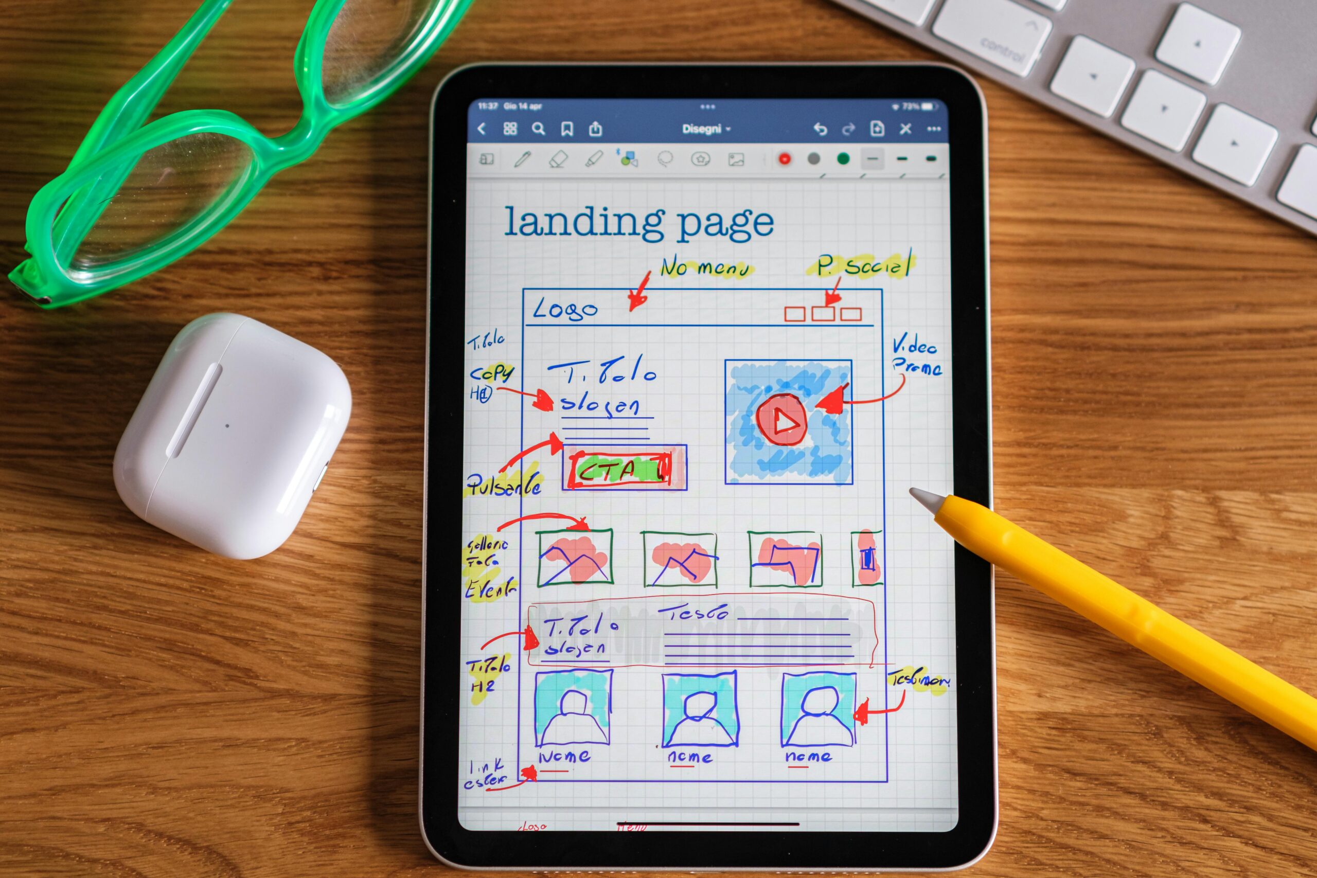
In the email marketing your landing page is often the first impression potential subscribers get of your brand. A well-designed landing page doesn’t just introduce your brand; it captivates, convinces, and converts. But how do you design a landing page that truly powers your email marketing efforts and drives sign-ups? Here’s a collection of insider tips and little-known secrets to help you craft an effective landing page that boosts your email list, builds engagement, and enhances conversion rates.
1. Prioritize Simplicity with a Clear, Singular Focus
One of the most common mistakes made in landing page design is overwhelming visitors with information. Remember, the purpose of your landing page is to encourage one action: subscribing to your email list.
Insider Tip: Make sure every element on the page—text, images, CTA buttons, and even colors—supports this goal. Avoid adding unnecessary links, large blocks of text, or too many visual elements, which can distract from your primary message. A clean, well-organized page with a singular focus improves user experience and keeps attention where it matters.
Pro Tip: Use white space to your advantage. A simple, clean layout with strategic white space draws the visitor’s eye naturally to your call-to-action.
2. Offer a Value-Driven Lead Magnet
Why should someone subscribe to your email list? Without a clear, compelling reason, potential subscribers may not take action. This is where a lead magnet comes in. Lead magnets are incentives offered in exchange for an email address, such as an e-book, checklist, template, or exclusive discount.
Little-Known Secret: People are more likely to sign up when they feel they’re getting something valuable in return. Think about your audience’s needs and what would make them willing to trade their email address. Instead of a generic offer, make your lead magnet specific to the visitor’s pain points and desires.
Insider Insight: Use scarcity to your advantage. Words like “limited-time offer” or “exclusive access” can increase urgency and make the lead magnet even more appealing.
3. Use a Strong, Compelling Headline
The headline of your landing page is your first chance to make an impact, so make it count. An effective headline is clear, concise, and speaks directly to the visitor’s needs or goals.
Insider Tip: To maximize engagement, your headline should address a pain point, offer a solution, or evoke curiosity. It’s crucial that it directly reflects the value of the lead magnet or your email content. For example, “Get Exclusive Tips to Master Email Marketing” is clear and benefit-focused.
Proven Technique: Split-test different headlines. Sometimes a small tweak, such as changing from “Get Started with Email Marketing” to “Unlock Expert Email Marketing Tips,” can make a noticeable difference in conversions.
4. Add Social Proof for Credibility
Social proof—such as testimonials, reviews, or subscriber counts—helps build trust and credibility. Visitors are more likely to subscribe when they see that others are benefiting from your content.
Little-Known Secret: Consider including a few short testimonials from current subscribers who value your emails. Even a simple “Join 5,000+ Subscribers Who Get Weekly Insider Tips” can make a big difference.
Advanced Strategy: If you’re just starting and don’t have testimonials or large subscriber numbers, show trust badges (like security symbols) or use statements such as “as featured in” with logos of reputable media where you’ve been mentioned. This small boost in credibility can help reassure new visitors about subscribing.
5. Optimize Your Call-to-Action (CTA)
The call-to-action (CTA) button is the most crucial element of your landing page. To encourage users to click, make your CTA text clear, action-oriented, and benefit-driven.
Insider Tip: Instead of using a generic CTA like “Submit” or “Sign Up,” use persuasive language that reiterates the value of subscribing. Phrases like “Get My Free Guide” or “Access Expert Tips” remind the user what they’ll receive and make the button more enticing.
Ninja Tactic: Position your CTA above the fold (the part of the page visible without scrolling) so it’s immediately accessible. For longer landing pages, include multiple CTA buttons strategically placed throughout.
6. Leverage Visuals Wisely
Visual elements like images and videos can be powerful tools for capturing attention and enhancing your message. However, visuals should never detract from your main goal—gaining subscribers.
Behind-the-Scenes Secret: Use images that evoke emotion or support your message, like a picture of someone engaging with your product or service. A relevant image can make your landing page more relatable and inviting.
Expert Insight: If you’re including a video, keep it short and directly tied to the value proposition of your email list. A well-made video can boost engagement by showcasing your brand personality and making visitors more comfortable subscribing.
7. Use a Simple, User-Friendly Form
A landing page that’s easy to use is far more likely to convert visitors into subscribers. A long or complicated form can be a huge deterrent.
Proven Technique: Stick to the essentials. Ask for the minimum amount of information required—usually just a first name and email address. Fewer fields mean less friction and a higher likelihood of form completion.
Hidden Gem: If you want to personalize your emails with more details, consider using progressive profiling in future interactions instead of requesting all details upfront.
8. Craft a Persuasive Subheadline
The subheadline is a great opportunity to expand on your headline and clarify the unique value of subscribing. This is where you can provide more context about what your email list offers and why it’s worth joining.
Insider Knowledge: Subheadlines that focus on the benefits of your lead magnet or email content tend to perform better. Think about what will appeal most to your audience, and be clear about the tangible results they can expect from subscribing.
Top-Secret Strategy: Consider using bullet points to break down the benefits of your emails into easily digestible chunks. For example:
- Exclusive tips to boost your email marketing
- Proven strategies to grow your audience
- Insider knowledge from industry experts
9. Optimize for Mobile Users
With more people browsing on mobile devices, ensuring your landing page is mobile-friendly is essential. A poor mobile experience can cause potential subscribers to abandon the page.
Little-Known Secret: The best mobile landing pages are simple, with clear CTAs and minimal distractions. Buttons should be easy to tap, and text should be legible without zooming.
Advanced Technique: Check how your landing page appears on different screen sizes, and ensure the form is visible and usable on all devices. Use tools like Google’s Mobile-Friendly Test to identify any issues with mobile optimization.
10. Test, Analyze, and Refine
No landing page is perfect on the first try. Continuous improvement is key to creating a high-converting landing page for email marketing.
Insider Tip: Use A/B testing to experiment with different elements, such as the headline, CTA, and lead magnet. Analyzing user behavior and engagement data helps you identify what’s working and what needs adjustment.
Rare Insight: Track key metrics like conversion rates, bounce rates, and click-through rates to get a better sense of how users interact with your landing page. Make small, iterative changes and test them over time to see what brings in the best results.
Bonus: Keep Your Tone Conversational and Engaging
Lastly, remember that your landing page should reflect your brand’s personality. Avoid jargon or overly formal language, and aim to communicate in a way that feels personal and inviting. This approach makes visitors more likely to trust your brand and engage with your content.
A landing page designed with these insider tips and little-known secrets in mind can be a game-changer for your email marketing strategy. By providing real value, building trust, and simplifying the user experience, you create a powerful gateway for subscribers eager to engage with your brand.


